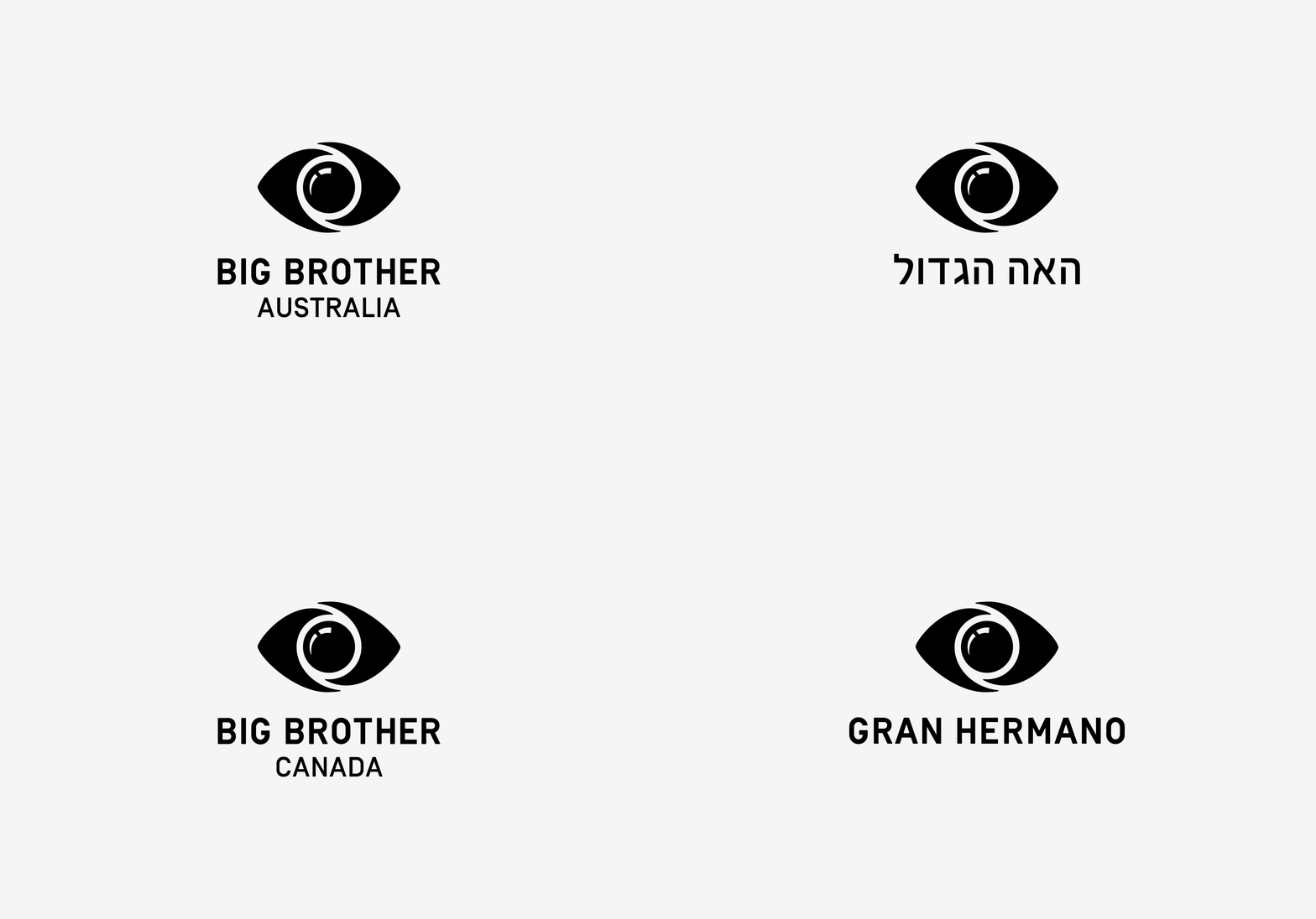
As one of the world's most popular TV concepts, Big Brother has grown and evolved since its launch in the Netherlands in 1999. Now aired in more than 49 countries across the globe, we helped Endemol create a new, compelling and consistent identity, that would work across all languages and cultures.
The identity uses the 2 most identifiable symbols of the programme, the eye and the camera. The new logo retains the eye and the sense of a camera lense, but also adds a more psychological, twisted and sinister edge in the new refined logo.
The graphic elements of the identity are used cleverly with photography, to create immediately memorable marketing and promotional collateral.


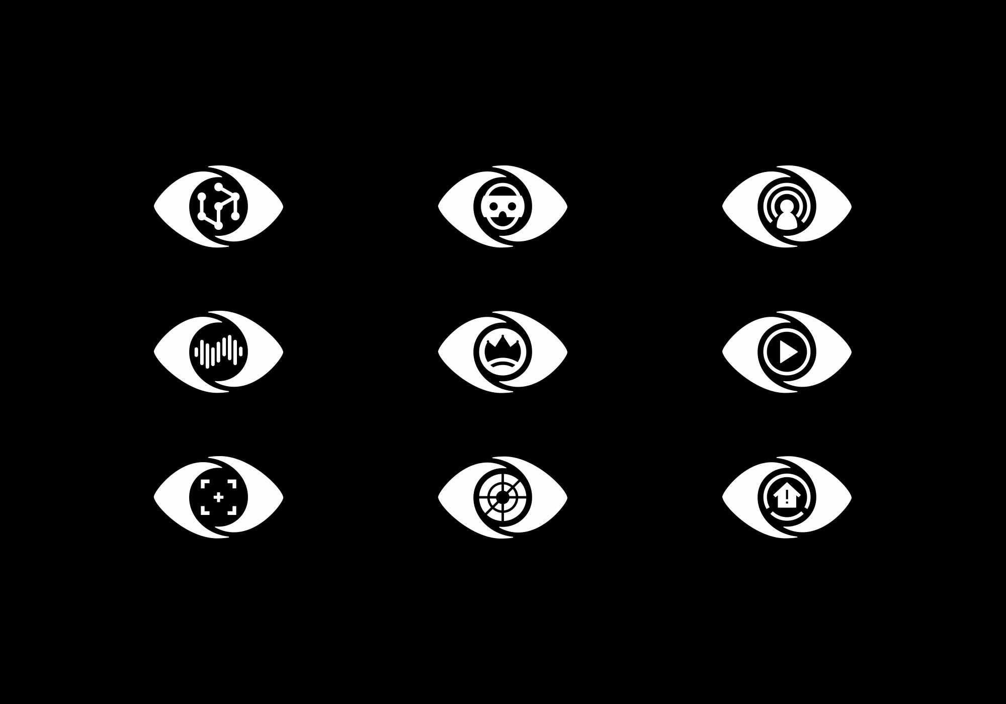
A whole series of icons were developed based on the logo and representing various aspects of the show. They are used within the programming itself as a form of visual shorthand.


As the brand crosses borders into 49 distinct countries, a detailed brand bible was prepared for use by the production designers of each production. It illustrates every elements of the brand and its use.


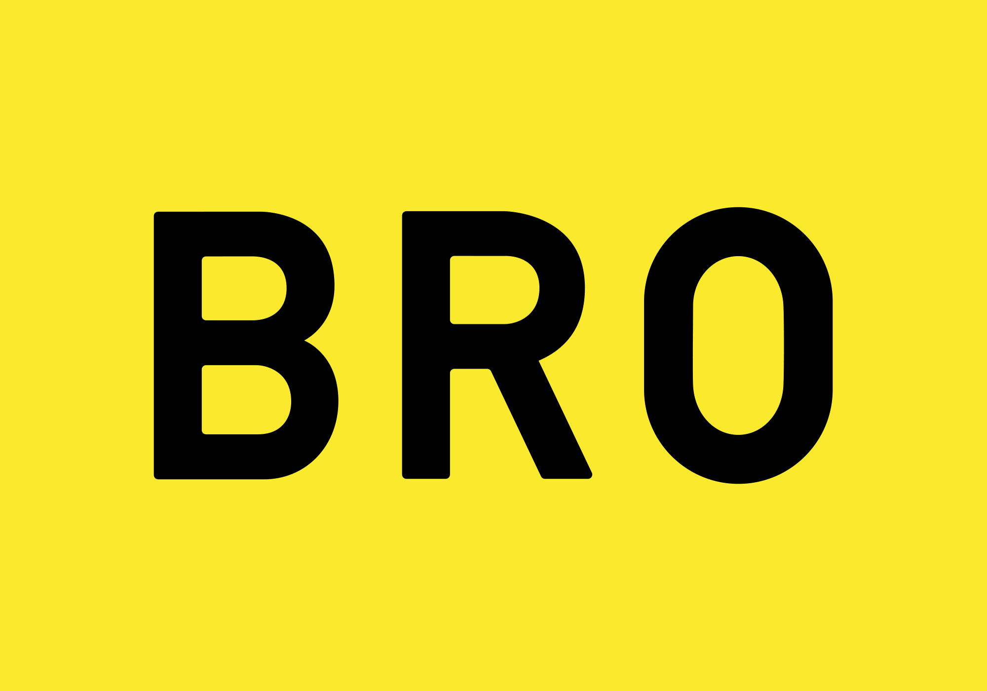
The Big Brother wordmark is a personalised version of Simplon. It has been adapted to harmonise with the rest of the new brand and be unique to Big Brother.


